UX MOBILE APP
ECOMMERCE DESIGN STRATEGY + PROTOTYPE
1. PROJECT BRIEF
The objective was to improve users' in-store experience at a local grocery store by designing a specific part of the mobile app experience. Based on pain points found during user research, I focused on the map and list/cart.
My target users were adults ages 18-79, who grocery shop regularly and use a smartphone. For this project, I surveyed users fitting this demographic and analyzed their survey data.
2. USER RESEARCH
SURVEY FOCUS AREAS
Logistics - How can the pickup process be improved? Delivery versus in store pickup? Alerts for the store being busy, out of stock, weather ?
Frequency & Demand - Impacts the menu and types of improvements that can be made, such as a reward system based on repeat purchases.
Navigation Preferences - Which setup works best for an app to help customers create a shopping list? There should be an option to duplicate previous lists.
User motives What is rewarding about the shopping experience? What would keep them returning versus turn them away?

SURVEY DATA ANALYSIS : USER AFFINITY MAP, APP CONTENT NOTES + PIE CHARTS
Key Features
A strong map and list view, product details matching store inventory etc.
Navigation
Personalized pathing based on where their list items are within the store layout; open to free browsing as appropriate.
Product Categories
Household, Frozen, Produce, Pantry, Fresh Foods, Beverages, Health & Beauty, Baby, Pets, special offers.
Purpose
Experience of finding new products, basic need, finding particular recipes.
Shopping Perspective
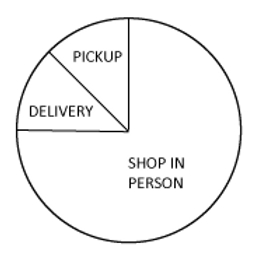
In person by memory or list premade, app order + pickup from store; delivery not common in this survey group.
Usage Frequency
Shopping weekly, every 2 weeks, 1-2 times a month.

3. UX STRATEGY+

USER ACTION FLOW
USER JOURNEY MAP
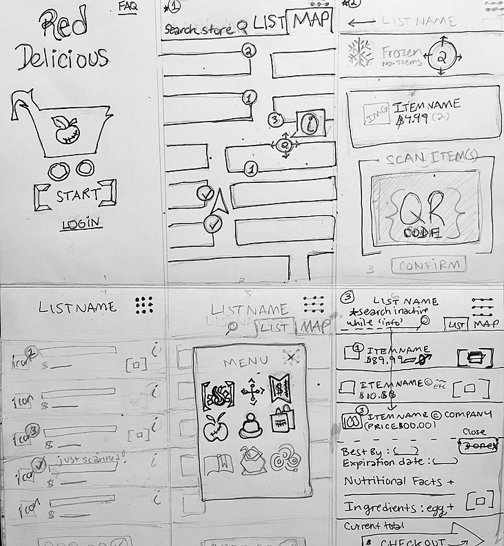
WIREFRAMES: INITIAL SKETCHES
DIGITAL WIREFRAMES

4. TESTING
I conducted 3 usability tests with each of the 5 participants from the previous survey. Red represents users who could not complete the assigned task and the bullet points below each chart are my solutions (applied to the prototype).
1/5 Users were unable to use the search bar for Task 1: Find and add a specific item to the CART screen.

-
Improved the functionality of the initial map and list screens.
2/5 Users were unable to edit the CART/ LIST screen and see changes for Task 2: Edit the List with prompts.

-
Upgraded the list editing features & instructional screens to a 2 minute tutorial. Once completed, the edits reflect in the user's cart and later checkout screens.
1/5 Users were confused about how to scan the deals and whether there was an updated total for Task 3: Scan and redeem a Sale/Deal Ticket.
-
Added a checkout screen to demonstrate the deals' impact on the total in 'real time' for the user.
I am updating this prototype with UI features & more functionality.
ETA for the next version is 7/2024.